Everything here was loved by someone else first.

How I came up with Someone Else's, a thrift store where every piece comes with a little history.

The idea in one line

Every piece has a tag with one detail from its past. You might find out where it was bought or what someone wore it to.

The prompts

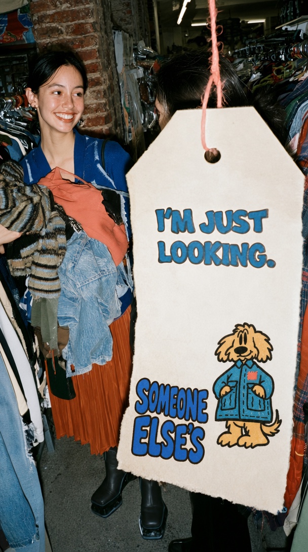
A giant cream tag on a coral cord in front of two friends browsing a packed thrift store

I'm just looking

A vertical 9:16 direct-flash snapshot inside a crowded neighborhood thrift store. Put an oversized warm cream paper tag close to the lens on the right, hanging from a coral string threaded through a punched hole. Give it clipped top corners and a rough paper edge. Print the exact words "I'M JUST LOOKING." in chunky cobalt lettering on two lines. Near the bottom, place the supplied stacked Someone Else's wordmark next to the shaggy golden dog in its oversized blue jacket with the coral repair patch.

Behind the tag, catch two friends mid-conversation by a packed clothing rack. Keep one friend's smile visible on the left as she holds a messy armful of denim, rust-colored fabric, and striped knitwear. Include an exposed brick column and close rows of hangers. Let the flash pick up the grain in the tag and the textures of the clothes, with the back of the shop falling into shadow. Frame it like a friend took the photo in the aisle.
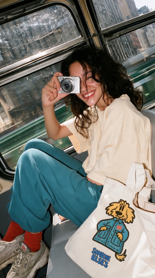
A smiling person with a compact camera on a train next to a canvas tote printed with the Someone Else's mascot

The tote on the way home

A vertical 9:16 candid snapshot on a city train. A person with loose dark hair sits sideways by a scratched window, knees bent, smiling with a small silver point-and-shoot camera held up to one eye. Dress them in a roomy cream tee, teal trousers, red socks, and worn sneakers. Tilt the frame slightly and let city buildings pass outside the window.

Set a slouchy, unbleached canvas tote beside them in the lower right foreground. Print the supplied shaggy dog in its denim-blue jacket with the coral patch and place the stacked cobalt Someone Else's wordmark underneath. Let the print follow the folds in the canvas. Keep the tote partly in frame and the artwork readable. Use bright daylight through the window and a touch of direct flash, with reflections on the glass and a little grain like a photo from a friend's camera.

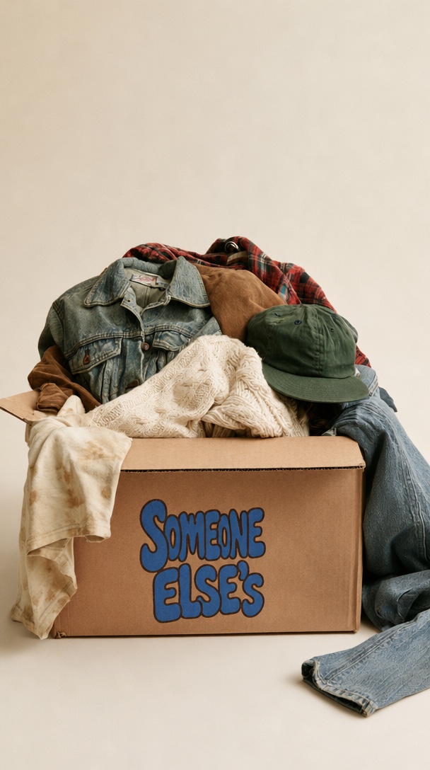
An open cardboard box printed with Someone Else's and filled with worn denim, knitwear, plaid, and a green cap

A box of secondhand clothes

A vertical 9:16 still life of an open kraft cardboard box overflowing with secondhand clothes. Frame it close to straight on and high enough to see into the box. Put a faded denim jacket and rust plaid near the back, a cream cable-knit sweater spilling over the front, and an olive cap on top. Let a worn cream tee fall over the left flap and a pair of jeans spill to the floor on the right. Keep the folds loose, like someone set the clothes down by hand.

Print the supplied stacked Someone Else's wordmark in cobalt with its dark outline directly on the front of the box. Keep the cardboard grain visible through the print and the lettering legible. Use a warm off-white wall and floor with plenty of empty space above the pile. Light it softly from one side to show the worn denim seams, knit stitches, and rough edge of the cardboard.

How I came up with Someone Else's

I started by thinking about how you'd shop

When I first thought about opening a thrift store, I tried a weekly edit, outfits you could buy as a set, a bring-one-take-one wardrobe swap, and an archive where you could look up clothes by decade or fabric. The two I kept coming back to were shopping somebody's closet and finding out a little about the past of each piece.

I liked the closet idea because I could picture going straight to a rack of clothes picked by someone whose taste I loved. But the history idea worked even if you found one jacket on a rack full of completely different things. You could take the story home with you. That's the one I wanted to build the shop around.

The name came from the other idea

I'd already written down Someone Else's when I was thinking about the closet version. I kept it because it made even more sense once I decided each piece would come with a story. If someone asks, "Whose jacket is that?" the name is already an answer.

I landed on "Everything here was loved by someone else first." I liked how casually that explained what you'd find in the shop. You could say it to someone while handing them a jacket.

How much can you put on a tag?

I wanted you to be able to get the whole thing while holding a hanger in one hand. "Worn to three weddings" was the example that made it click for me. I start wondering what the weddings were like as soon as I read it.

  • Bought in Tokyo in 2019.
  • Worn to three weddings.
  • Found at a flea market in Copenhagen.

If I opened the shop for real, I'd use whatever detail I could verify. A place or a year is enough. I'd keep the size and price easy to find, and save the cheekier lines for places like the mirror and the sidewalk sign. "We don't gatekeep good taste here" feels like something the shop would say back to you.

The dog had to have a good jacket

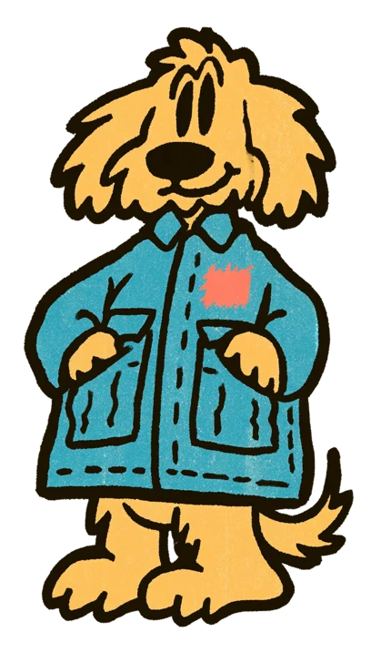
I wanted a wordmark that could hold up on a shop sign and a character I could tuck into smaller spots around the store. I kept coming back to the drawings on my mood board with heavy ink lines and slightly scruffy edges. When I got to the dog, the oversized work jacket made me want to keep going. Even the dog looked like he'd found something good on the rack.

I compared a smoother version and a shaggier one. I kept the shaggy one for the ragged ears and that crooked smirk. For the small version, I cropped in on the face and upper jacket and kept the collar, a pocket, and the coral patch. You can still tell it's the same dog. I'd put the full version on a tote and save the little one for things like stickers or a painted bookend.

I kept the shop bright

I liked the uneven ink and print grain in the lettering. When I got to the storefront, I wanted the cobalt sign to look just as good against fresh cream paint. The brick, reflections in the window, and actual clothes on the rack give you plenty to look at. I'd use that same blue and warm paper on the printed pieces, with a little coral where it makes sense.

For the shop photos, I kept picturing the kind of photo a friend would send you while you're out. Someone laughing with an armful of clothes, a bag on the train, or a hand pulling a jacket off the rack. I'd put the logo where it would actually be, printed on the bag or on a sign in the room.

The palette

Cobalt blue #286CCB
Wordmark, shop trim, and lettering.
Warm paper #FFF0D8
Garment cards, bags, and signs.
Inky black #211A13
Outlines, body text, and stamps.
Coral red #F47763
The repair patch and small accents.
Golden tan #F3BC54
The dog's fur and occasional posters.
Denim blue #289AB7
The dog's jacket and illustration details.
A shaggy golden dog in an oversized blue jacket with a coral repair patch

Now that's the fake brand for the week!

Someone Else's isn't real. Yours is.

I help founder-led brands find their direction — through strategy, creative concepts and selected applications.

Tell me about your brand